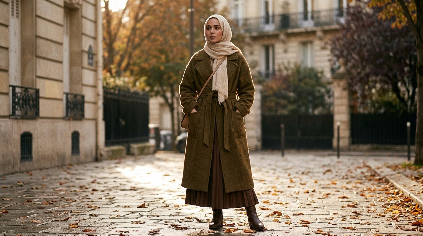
Fall 2026’s Color Palette Splits Down the Middle — and Covered Dressing Changes Which Half You Can Actually Wear
There is a rule nobody writing colour reports has to think about, and it decides everything if you dress modestly.
Colour is not a shade. It is a shade multiplied by surface area.
On a mini dress with bare legs, this season’s fuchsia is a pop — a third of the silhouette, framed by skin and shadow. Put the same fuchsia on a floor-length dress with long sleeves and a matching scarf and it is not a pop. It is eighty to ninety per cent of you, uninterrupted, from the crown of your head to the floor. Same colour. Completely different garment.
That is why a fall 2026 colour report you read on a mainstream site and a fall 2026 colour report for a covered wardrobe cannot say the same thing. Below is the second one.
The short answer
Fall 2026’s palette splits in two: grounded earth tones (Burnt Olive, Red Mahogany, Muted Clay, aubergine, chocolate) and saturated statement shades (Festival Fuchsia, Green Envy, Acacia yellow, cobalt, tomato red). For modest dressing, the first group works as a full-length base. The second works best in accents.
What the season’s palette actually is
Two things are happening at once this autumn, and most round-ups only report one of them.
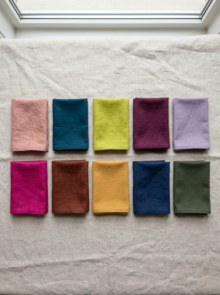
Pantone published its Fashion Color Trend Report for New York Fashion Week Fall 2026 with ten shades, and the Pantone Color Institute framed the season as anything but dull — a range running from earthy tones to high-spirited hues designed to suit minimalists and maximalists alike.
The ten, in Pantone’s naming:
| Shade | What it is |
|---|---|
| Muted Clay | A dusty, beige-leaning pink soft enough to behave like a neutral |
| Neptune Green | A rich aquatic tone sitting between blue and green, close to teal |
| Green Envy | An invigorating but calmer relative of the loud lime greens |
| Arabian Spice | A tangy purplish red inspired by a spice blend |
| Foxglove | A delicate lilac-meets-pink |
| Festival Fuchsia | The season’s saturated evening pink |
| Red Mahogany | A blend of cherry red and chocolate brown |
| Acacia | The new yellow, succeeding butter yellow |
| All Aboard | A maritime blue |
| Burnt Olive | A dark, streamlined green for people who don’t want colour at all |
Beyond the Pantone list, the wider Fall/Winter 2026 runways added their own recurring shades. Marie Claire’s runway edit identified magenta, mustard yellow as a warmer successor to butter, moss green as a wearable neutral-adjacent option, and head-to-toe tomato red. Coveteur reported deep eggplant emerging as a moody alternative to black and brown, cobalt blue holding across both recent seasons, and marigold appearing in tailoring and slip dressing.
One trend writer summed up the shape of the season neatly: the traditional autumn neutrals are still present, but they are sharing the stage with fuchsia, royal purple, chartreuse, aquatic green, clear red and bright maritime blue — and the defining colour story of the season is not one shade but the contrast between two very different approaches.
That contrast is the whole story for you. One half of the palette is designed to be worn as a base. The other half was designed to be seen in small quantities on a body that is mostly not covered.
The surface-area rule
Work out roughly what proportion of your silhouette a colour will occupy before you buy it.
A colour on a maxi dress or abaya is a base colour. It carries the outfit.
A colour on a long skirt or wide trousers is roughly half the outfit.
A colour on a scarf, bag, boot or knit is an accent.
Now apply it. Burnt Olive across a floor-length silhouette reads as calm and expensive. Festival Fuchsia across the same silhouette reads as a costume unless you are deliberately going for maximum drama — which is a legitimate choice, but it should be a choice, not a surprise you discover in the mirror.
This is not about toning yourself down. It is about knowing what the garment will do before you pay for it.
The four that work as a full-length base
Burnt Olive. The single most useful shade of the season for a covered wardrobe. Pantone positions it as the option for people who genuinely do not enjoy wearing colour — a dark green that reads streamlined. It behaves like a neutral, takes gold jewellery beautifully, and it is significantly less severe than black in daylight. A Burnt Olive maxi is the least risky purchase on this list.
Red Mahogany. A blend of cherry red and chocolate brown — which means it has the richness of a red without red’s volume. Over a full length it reads as depth rather than statement. This is the shade to buy if you have wanted to wear burgundy but found it ageing; the brown in it warms it.
Muted Clay. Dusty and beige-leaning enough to slot into a capsule wardrobe as a neutral. The most underrated of the ten. It is a light base colour that is not cream, not beige and not grey, which is a genuinely rare thing.
Neptune Green. Sitting between blue and green, close to teal. Deep enough not to overwhelm at full length, unusual enough that nobody will ask where you got it. Excellent with silver and with pearl tones.
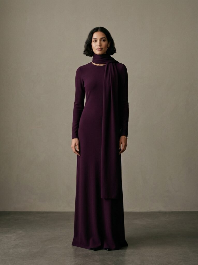
Aubergine and chocolate brown are not on the Pantone ten but sit in the same family and behave the same way. Deep eggplant appeared across Fall/Winter 2026 as a muted alternative to black and brown — and for a long silhouette, that is exactly what it does.
The four that belong in accents
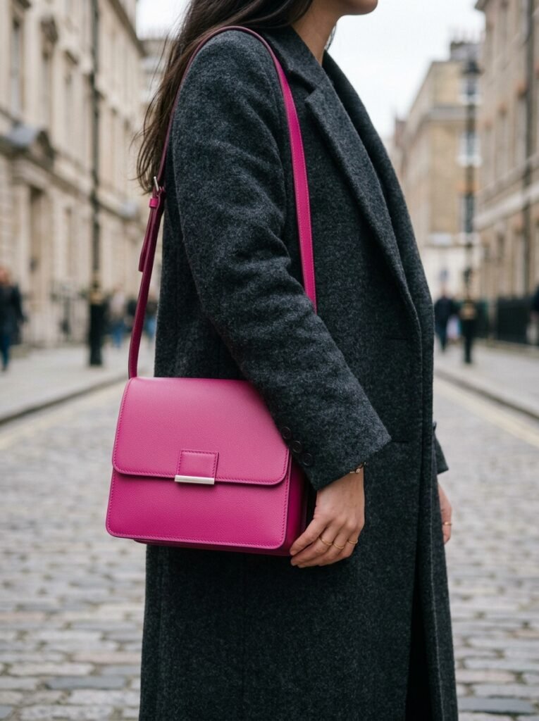
Festival Fuchsia. It surfaced as an eveningwear shade at Sergio Hudson and LaQuan Smith. On a maxi, this is a decision the whole room will make about you before you speak. If you want it, take it as a scarf, a bag, or a knit under a dark coat.
Green Envy. Calmer than the loud limes but still invigorating, and shown as head-to-toe tonal looks. Tonal head-to-toe on a covered body is a lot of chartreuse. A shoe or a bag gives you the entire trend for a fraction of the exposure.
Acacia. The new yellow of the season, succeeding butter yellow. Yellow is the shade most affected by the surface-area rule — it advances visually, so it expands. A cardigan or a scarf, not a dress.
Arabian Spice. A tangy purplish red. This one is borderline: at full length it can work if the fabric is matte and heavy. In anything shiny it becomes very loud very quickly.
The two that go either way
All Aboard and Foxglove are the flexible ones.
Blue is worth paying attention to this season for a reason that has nothing to do with fashion. One colour-analysis practitioner made the point that the prominence of blue this autumn challenges the assumption that autumn dressing has to be warm — for someone with cool colouring, blue may be a far more natural way into the season’s trends than being forced into rust and mustard.
If warm autumn shades have always looked slightly wrong on you, that is probably why. Take the blue.
The hijab is the piece where undertone actually matters
Here is where covered dressing needs different advice rather than adapted advice.
Every other garment in your outfit sits away from your face. Your scarf does not. It frames your face completely, at the closest possible distance, in whatever light you happen to be standing in. It is the single highest-stakes colour decision in your wardrobe, and it is usually the one made last and cheapest.
Three things worth knowing:
Undertone beats shade. Green this season is not one trend at all — Pantone’s palette alone contains Neptune Green, Green Envy and Burnt Olive, and in a colour family like green a small shift in undertone produces a dramatically different impression: a blue-green behaves nothing like an olive, and a yellow-green nothing like a deep forest. The same is true of every family here. Two “burgundy” scarves can do opposite things to your complexion.
Test at the face, in daylight, before buying. Not against your arm. Not under shop lighting. Hold it where it will actually sit.
Saturated brights near the face need a buffer. If you want Festival Fuchsia or Acacia at the face, put a neutral layer between it and your skin — a cream underscarf edge, a soft collar — or move the bright to your outer layer and keep the scarf quiet.
How to combine these colours
The most useful advice published on this season’s palette had nothing to do with which shades are in.
One trend guide recommended breaking the habit of pairing every trend colour with black, and suggested combinations that are actually emerging instead: burgundy, plum, aubergine or red mahogany to soften a hard contrast; cherry with chocolate, tomato red with camel, burgundy with cognac; and chocolate, charcoal, navy or olive to make chartreuse wearable. Its sharpest point was about intensity — play with different depths rather than matching them, because a pale pink with oxblood is far easier to wear than two equally bright colours.
For long silhouettes, that translates into three reliable formulas:
One colour, three depths. Burnt Olive coat, moss knit, deep forest scarf. This is tonal dressing done properly, and on a covered body it reads as intentional rather than accidental.
Deep base, warm accent. Aubergine maxi with a cognac bag and boots. The brown stops the purple from going gothic.
Neutral base, one bright at one point only. Chocolate or Burnt Olive head to toe, and Festival Fuchsia in exactly one place. One. Not the scarf and the bag and the shoe.
The rule underneath all three: when the surface area is large, contrast should be low and depth should do the work. When you want contrast, buy it in small pieces.
Five things to buy, in order
If you are building the season rather than shopping it, the order matters more than the list.
- A Burnt Olive or Red Mahogany full-length piece. The base. Everything else styles around it.
- A Muted Clay knit. The light layer that is not cream.
- One scarf in a colour you have tested at your face. Not a set. One good one.
- A cognac or chocolate accessory. The bridge that makes deep tones warm instead of severe.
- One accent in a bright — bag, shoe or knit — in whichever of the loud shades you actually like. Fuchsia, Acacia, Green Envy, cobalt. Your choice, small quantity.
That is a full season for the price of what most people spend on two impulse dresses in colours they never wear twice.
Key Takeaways
- Fall 2026’s palette splits into grounded earth tones and saturated statement shades — and covered dressing changes which half is usable as a base.
- Burnt Olive, Red Mahogany, Muted Clay and Neptune Green are the four that work at full length.
- Festival Fuchsia, Green Envy, Acacia and Arabian Spice are best taken as accents.
- All Aboard blue and Foxglove are flexible — and blue is the best route in for anyone with cool colouring.
- The hijab is the one garment where undertone genuinely matters, because it frames the face. Test it in daylight, at the face.
- Stop defaulting to black. Vary depth rather than matching intensity, and let deep neutrals carry the bright.
- When surface area is large, keep contrast low. When you want contrast, buy it small.
FAQ
What are the fall 2026 color trends?
Pantone’s New York Fashion Week Fall 2026 report named ten shades: Muted Clay, Neptune Green, Green Envy, Arabian Spice, Foxglove, Festival Fuchsia, Red Mahogany, Acacia, All Aboard and Burnt Olive. Wider runway coverage also highlighted magenta, mustard, moss green and tomato red along with deep eggplant and cobalt blue.
Which fall 2026 colours are best for modest outfits?
Burnt Olive, Red Mahogany, Muted Clay, Neptune Green, aubergine and chocolate brown. They hold their character across a long silhouette without dominating, and they take both gold and silver.